

Why you should still stay home if you can, summed up in one grim chart
Why you should still stay home if you can, summed up in one grim chart.
There’s no second wave. You’ve just gotten used to being in high tide.
We are still in the thick of a pandemic. There is no COVID-19 vaccine, and it’s still not safe to be in a crowd of people. Especially without face masks. Yet many states have given businesses the green light to reopen (albeit to varying degrees). If that seems ill-advised, you’re not wrong, as one chart deftly sums up.
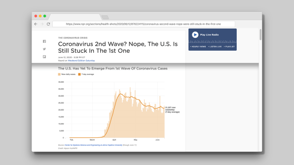
The chart, by Alison Hurt at NPR, shows that an average of around 20,000 Americans are still contracting COVID-19 every day, and the stark, exponential climb of coronavirus cases in late March and early April has not yet been mirrored by an equally sharp decline. While the world outside might start to look familiar, as economies lurch back open, Hurt’s chart shows that the underlying health risks are very much still there. Want to resume activities as normal? We’d need a Mariana Trench-level drop in positive COVID-19 cases. What we have is a plateau.
And even that threshold is comparatively high. Overall, the United States leads the world in positive coronavirus cases. There have been more than 2 million COVID-19 cases in the U.S.—about a quarter of the world total—even though the U.S. has just 5% of the total world population. This can be attributed to several key missteps, including critical shortages of PPE, limited availability of COVID-19 tests and contact tracing, and lockdown delays. The Obama administration left a playbook for dealing with a pandemic. No such game plan here.
See the full size infographic and read the story here. [Screenshot: NPR]
The chart shows two data sets: new daily cases as a light orange bar graph, overlaid with a dark orange trend line indicating a seven-day average. While it does indicate a slight decline, it also suggests that we are still closer to the apex of the chart—its highest point—rather than the baseline. (Not to mention the fact that this is the national average—23 states have seen a surge in positive cases over the past 14 days. Arizona’s average of positive daily cases has almost tripled in that same time period, yet Governor Doug Doucie is still not requiring Arizonans wear masks.)
The relatively static number of cases at a nationwide level has to do with the coronavirus’s “reproduction number,” or R for short. It tells you how many people a person diagnosed with the virus will go on to infect. For instance, if R=2, then each infected person will infect two others, so two cases become four, four become eight, and so on. The stay-at-home orders and social distancing have brought that ratio slightly below 1.0 to .91, meaning each infected person infects one new person, data scientist Youyang Gu told NPR. It needs to fall far below 1 in order to drastically decline. And according to Gu, the reproduction number has started to increase in more than two-thirds of states now that they have started to open up.
What this chart strikingly indicates is that we’re nowhere near “normal.” It also indicates the mortal danger of complacency. There isn’t a second wave—we’re still in the first. A lot of people have just gotten used to treading water at high tide.
#safeathome #depression #isolation #kids #quarantinekids #quarantine #unminced
TRENDING COLLECTIONS